Shared Gallery
Adding and Setting Up the Shared Gallery App
With the Shared Gallery app, you can start sharing your photos and videos by uploading them to your gallery.
Customize how your Shared Gallery looks and behaves by changing the settings, the access permissions, the title and description, the layout of your albums and photos, and the design of your gallery.
Tip:
You can also upload and manage your media from the Shared Gallery section of your site's dashboard.
In this article, learn more about:
Adding the Shared Gallery app to your site
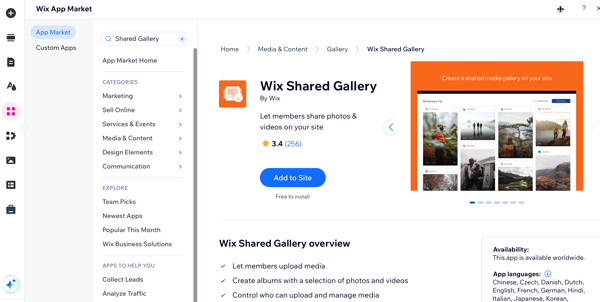
You can add the Shared Gallery app to your site from the Wix App Market.
Wix Editor
Studio Editor
Click Add Apps
 on the left side of the editor.
Search for the Shared Gallery app in the search bar.
Click Add to Site.
Customizing the app's settings
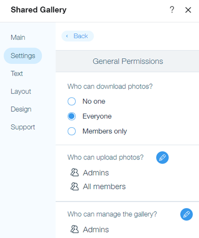
You can customize the Shared Gallery app through the Settings tab in the app's Settings panel. Here, you can control access levels for site visitors, enable features like comments, likes, tagging, and video uploads, choose the text direction within the app, and even delete all media if it's no longer needed.
To customize the settings:
Select the app in your editor.
Click Settings.
Click the Settings tab.
Click Set permissions to set the level of access that your site visitors have to your gallery. Learn more about permissions
Click Back.
(Optional) Click Manage site members to view and manage your site members in your site's dashboard.
Enable or disable commenting on photos and videos, tagging members on media, and video uploads under General.
Select a direction for the app's text under App direction. For example, if your site uses a right-to-left language, you can change the direction of your gallery to match it.
Tip:
Click Delete All if you want to remove all albums, photos, and videos in your gallery. This permanently deletes everything in your gallery including comments, views, and likes.
Changing the app's text and design
You can adjust the text and design of your gallery from the Settings panel in your site's editor. Create an engaging title and description to attract site visitors and customize the gallery's appearance to align with your site. Options for customization include the title and description, font style and color, button and icon colors, border colors, width, and shape, as well as hover effects for items in your gallery.
To change the text and design:
Select the app in your editor.
Click Settings.
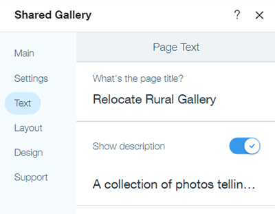
Click the Text tab.
Add a title and description for your gallery.
Click the Design tab.
Customize the design of your header, background, albums, photos, and the expanded version of your gallery items.
Header and background
Click Header & Background.
Select a font style and color for your page title, page description, "Sort by" text", and main button text under Header Style & Color.
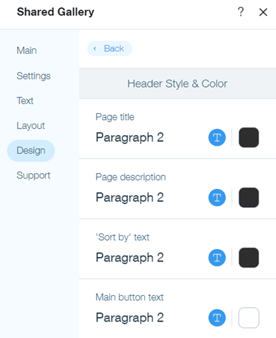
Select a color for your main button.
Drag the slider beside Button corner radius to make the corners of your gallery's buttons more or less rounded.
Adjust the background color of your gallery and set how opaque or transparent it is under Background.
Albums
Click Albums.
Select a font style and color for your album title and "items" counter & text under Albums.
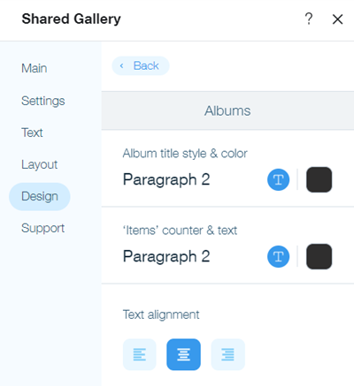
Select a left, center, or right alignment for your album text.
Select a color for the information card of each album.
Select a color that site visitors see when they hover over an album under Hover Mode. Drag the slider to set how opaque or transparent the color is.
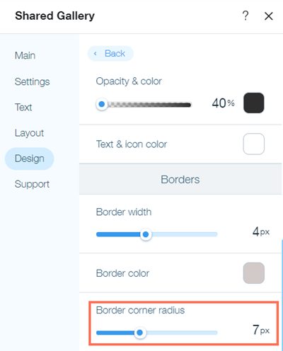
Set the width and color of your album borders under Borders.
Drag the slider to make the corners of your album borders more or less rounded.
Photos
Click Photos.
Select a font style and color for member names and social counters for comments, views, and likes.
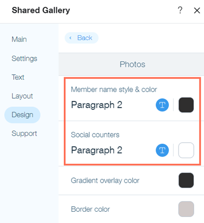
Select a color for the gradient effect that's applied to your photos and videos.
Set the width and color of the border around your photos and videos.
Drag the slider to make the corners of the border around your photos and videos more or less rounded.
Select a background color for the card that surrounds each photo and video and drag the slider to set how opaque or transparent the color is.
Expand Mode
Clicking on a photo or video in your Shared Gallery opens an expanded version of it. Select the colors and fonts of the text on the expanded versions of your photos and videos. You can also customize the color of the background of your expanded photos and videos and the icons that are displayed on them.
Click Expand Mode.
Select a font style and color for member names and the description text, buttons, and links in the information panel.
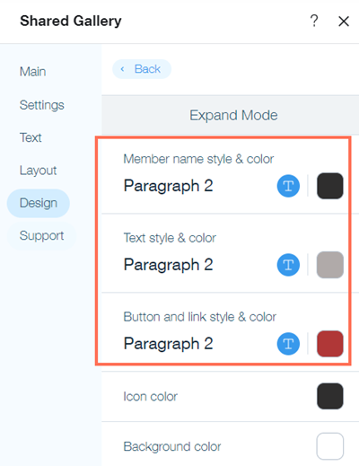
Select a color for the icons for moving between photos or videos and for closing the expanded version.
Select a color for background of the expanded version of photos and videos.
Customizing the app's layout
You can change the layout of the photos and albums in your gallery on the Settings panel of the app in your site's Editor. Customize the layout of your gallery and change settings such as the size and spacing of your photos and videos, the icons that are displayed on them, the style of your album cards, and the info that's displayed about each album.
To customize the layout:
Select the app in your Editor.
Click Settings.
Select the Layout tab.
Customize the layout of your photos and albums in your gallery.
Photos
Select a Minimal, Profile or Detailed layout for the photos in your gallery under Pick a style for your items:Minimal: Member name, upload date and description are visible when a user hovers over a photo.
Profile: Member name is visible above each photo.
Detailed: Member name and upload date are visible on each photo, with description below each photo.
Note: If you'd like descriptions to be displayed, scroll down to ensure the Show description text toggle is enabled.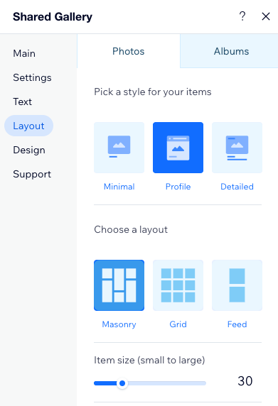
Select a Masonry, Grid, or Feed layout for the photos in your gallery under Pick a layout for your items.
Customize the size of your photos and videos. The number of items per row will adjust according to the item size and the size of the screen they're viewed on.
Note: this option is not available for the Feed layout.Set the spacing between each photo or video. You can select from between 0 pixels (no space between your images) to 64 pixels.
Choose if you want to display the number of views and likes a photo or video has. When selected, visitors will see this information at the bottom of each photo and video in your gallery.
Select whether to show the most recent, most viewed, or most liked photos first.
Albums
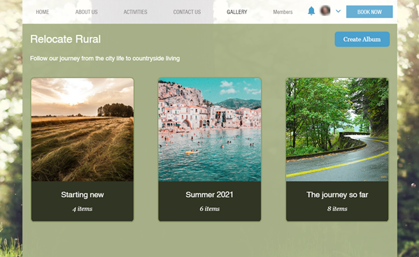
Select a style for your album cards:Classic: Information is displayed below an album's preview image
Overlay: Information is displayed on an album's preview image
Side-by-side: The album preview and information are displayed beside each other in rows
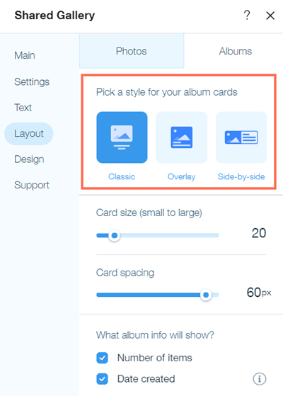
Customize the size of your album card. The number of albums per row will adjust according to the size of your card and the size of the screen they're viewed on.
Customizing the spacing between each album card. You can select from between 0 pixels (no space between your albums) to 60 pixels.
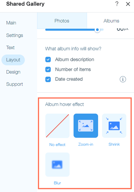
Choose the information to display on the album card. You can select the number of items in an album, the date the album was created, and an album description (side-by-side style only).
Select the effect that's shown when a site visitor hovers over an album. You can choose to have no effect, a zoom-in effect, a shrink effect, or a blur effect.